

Just in time.
Clockwork
An immersive e-commerce website that sells watches from around the world.

Project Type
Case Study, Personal Project
End
01/01/2025
Role
UX Designer, UX Researcher
Start
08/01/2024


Quick Links
01 Overview
A watch is not just a device that tells time - it is a fashion statement, it can bring an outfit together and there is are so many styles from various brands all over the world. Recently, on a trip to Japan with my friends we all bought watches in the Dontobori District in Osaka. One detail I recall is that each of the 5 watches we bought looked nothing like the other; there were distinct features that made it unique and valuable to each of us. That is when I realized how each timepiece is crafted with such elegance and care that it will always have a market and it is quintessential to one’s personality.
02 The Problem
The problem lies in the fact that most watches are very elegant and look beautiful however some of the e-commerce sites that either sell, repair or endorse these watches lack a visual or brand identity. Their user interfaces lack character and could use a re-vamp to showcase truly how amazing some of these products are while simultaneously explaining the stories and origins behind these timepieces. I believe that showcasing the mechanics and histories of theses watches can truly bridge the gap between consumers buying and being more immersed into watches.
03 Design Process
When beginning to proceed with the idea of how this e-commerce site should come together, the design process was split into three important phases: Empathize, Ideate and Design

1) Empathize
User Interviews - firstly it was important to generate some ideas via user interviews to see what the target market (watch consumers) would like to see in an e-commerce site that sells watches. The interviews consistent of 15-20 minute voice calls where users ranged from ages 23-25 and answered generic questions such as ‘what features in this site would help it stand out to you?’
Answers such as adding an accessories section to pair with your watch and its style, helpful guides for new users and neat animations were a great starting point on where ideation can start.
Personas - taking the user research a step further, 3 personas were created to generate an idea of what the target audience would be. It was inferred that the target market would be young adults to seniors who have either had a passion for watches for a while or simply wanted to get into it. One example would be Bradley Wells, a 28 year-old from Austin, Texas who recently picked up the hobby of watch collecting.
Empathy Maps - to complement the user interviews, empathy maps were also created. These maps gave valuable insight into what the users think, do, feel and say to see if we can find early user pain points as well as bridge common themes together before ideating.

Figure 1.1 - this persona depicts a user named Bradley Wells who recently picked up watch collecting as a hobby.

Figure 1.2 - this empathy map showcases how one of the participants of the user interviews (Humza) feels, thinks, does and says about the idea of the website.
Information Architecture - as a means of organization, these initial ideas and potential features were made into a Site Map to showcase the user flow and navigation of the website. This step is crucial both for the users as it provides a clear and easy navigation through the site, but also aids the design side to keep a balance and structure to the content.
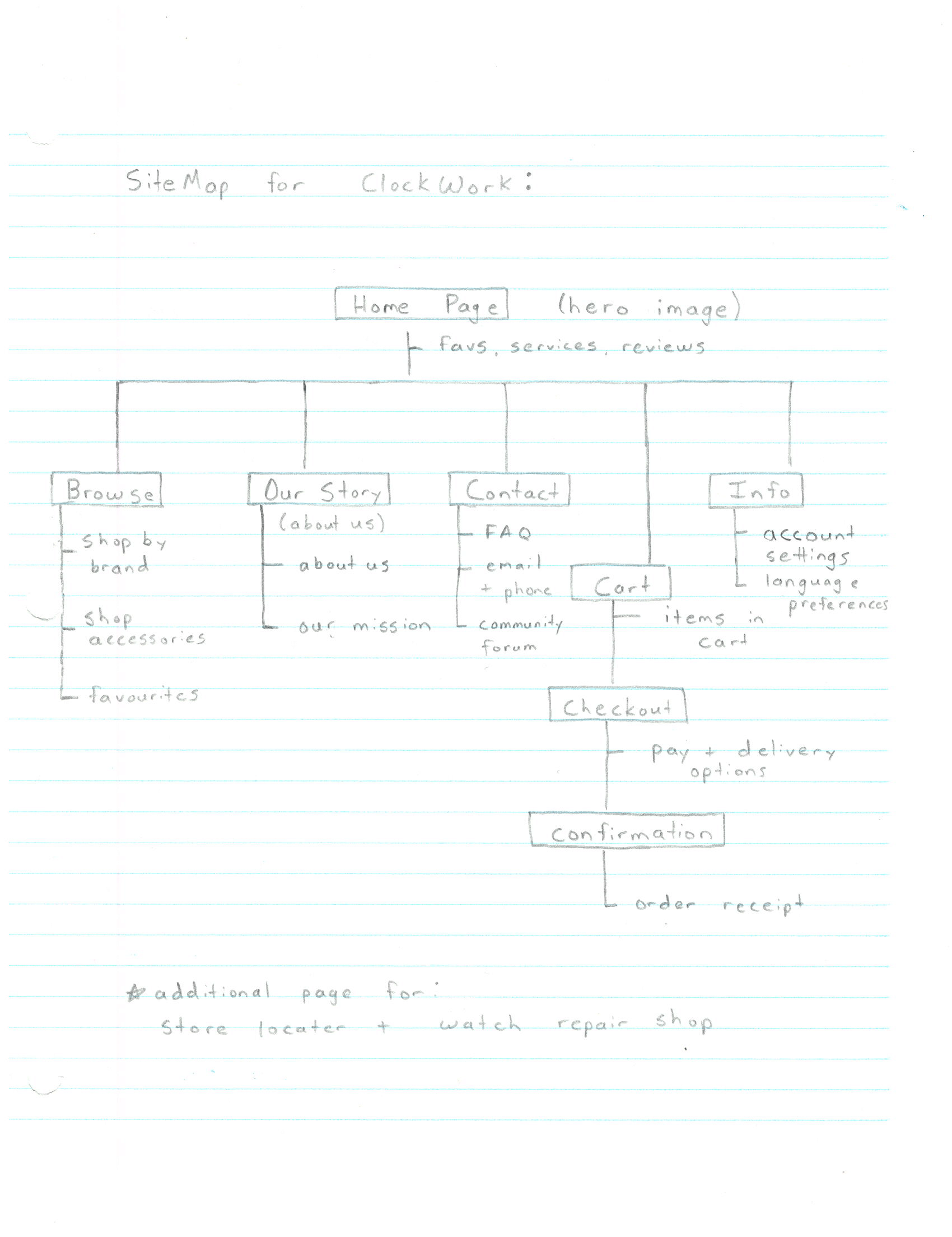
Figure 1.3 - this site map represents the hierarchal flow of the web pages of the design which provides designers as well as users clarity on the navigation flows on the site.
2) Ideate
Low-Fidelity Wireframes - once the Site Map was complete and a general understanding of each page and how they interact was complete, low-fidelity wireframes were made. Multiple designs were made for each screen and the best features from each were marked with a blue star and were considered for the low-fidelity prototype.
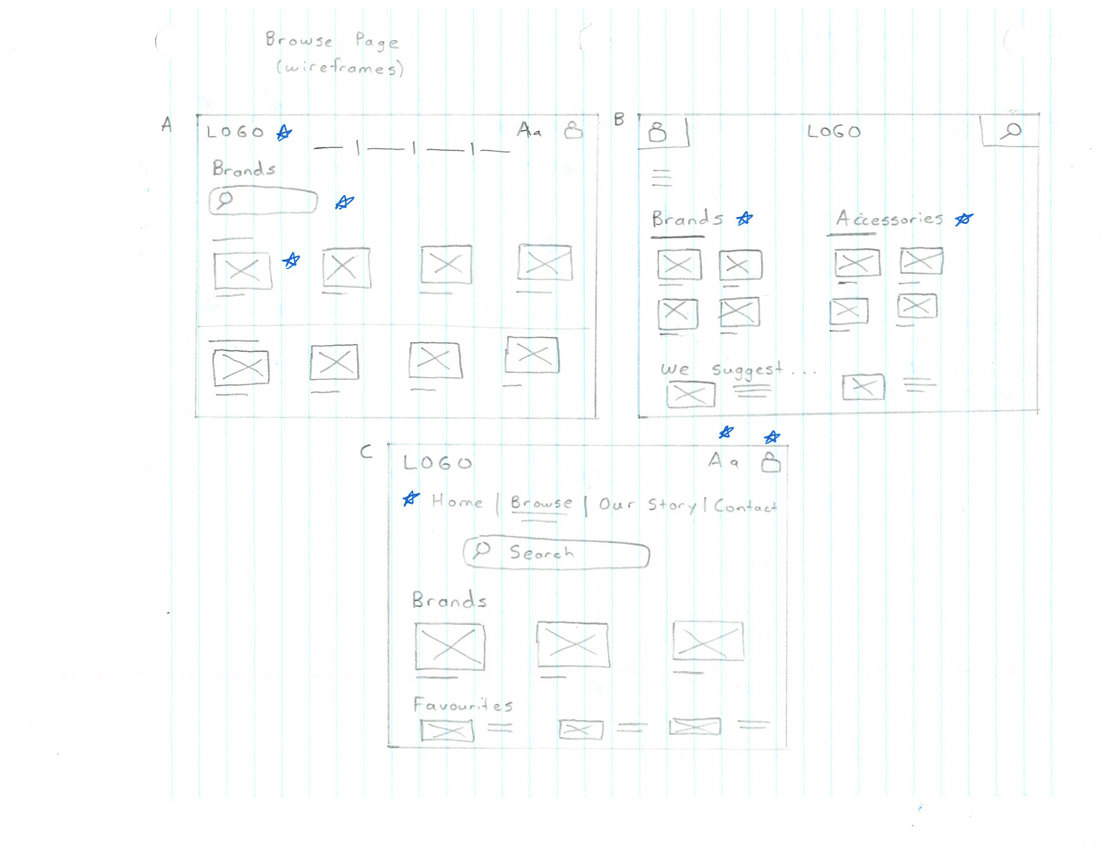


Figures 2.1 - the paper wireframes from the Home, Browse and Our Story pages.
Low-Fidelity Prototype - upon the completion of the paper low-fidelity wireframes and conversion to their digital counterparts on Figma, a low-fidelity prototype was created. The purpose of this prototype is to get a glance at the look and feel of the final designs while leaving room for feedback and improvements from users.

Figure 2.2 - the paper wireframes were converted to digital wireframes on Figma.
Usability Study - the usability study was the next logical step in the process to take the low-fidelity prototype and bring it to life with improved flows, animations and perhaps a stronger visual identity.
The usability study was a 15 minute moderated video call where the 3 users from the initial user interviews were tasked with 3 objectives. Their click path, observations, quotes and pain points were all documented for improvement opportunities in the near future.
Competitive Audit - the last part of the ideation process was to conduct a competitive audit to compare this product to direct and indirect competitors. The two direct competitors were CanadaWatchHouse and Luxury Watches Canada whereas the two indirect competitors were Watch World and Knar Jewellery. Meaningful insights and comparisons were made for improvement opportunities in the design phase.
3) Design
Affinity Diagram - the insights as well as themes, patterns and ideas that originated from the ideation phase were mapped onto an affinity diagram. This way, the ideas could be categorized and the information was presented in a more organized way to not only the designers, but other members of the team. The affinity diagram was created on an online software called Padlet.

Figure 3.1 - an affinity diagram created on Padlet to encompass and categorize all ideas presented thus far in the design process.
Insights - after deriving some of the patterns from the empathize and ideate phases, insights were made and categorized into P0, P1 and P2 priority.
P0 - High Priority - must be used for a minimal viable product (MVP)
P1 - Medium Priority - nice to have but not needed for a MVP
P2 - Low Priority - if time permits, these changes can be made
Colour Palette - when deciding on a colour palette, it was decided that a monochromatic colour scheme would fit best for the use case. Monochromatic colour schemes can be dynamic even if it is only just one main colour as certain tints and shades and saturation levels can bring together a calming feeling for the users.
In this specific case, a cooler colour scheme (blue) was used as blue often represented calmness, stability, wisdom and trust. When you think of the mechanics behind a watch and how elegant some of the people who are into watches act, a colour like blue is very symbolic and represents the values of watches (wisdom and trust).

Figure 3.2 - a monochromatic colour scheme was chosen to represent the design as the cool blue colours symbolize stability and wisdom.
Design System - continuing from the colour palette a design system was created to lay out the typography and components that are used in the design. This process makes it easy to re-use certain visual elements while maintaining consistency and balance in the design.
The typography used was the SF Pro Rounded typeface to give a modern look and feel to the text as well as the Instrument Serif typeface which added a bit of elegant and classy feel to the product.

Figure 3.3 - a design system to document the typography, colour schemes, buttons, icons, text fields and components was made.
Hi-Fi Mockup - the design system was in constant construction as the high-fidelity mockups were created. The low-fidelity screens were kept side-by-side to give a sense of direction while implementing some of the feedback and high-fidelity decisions from prior.


Figure 3.4 - some high-fidelity mockups for the Browse screen, Browse All Collections Screen and Cart Screen
Hi-Fi Prototype - once all the screens were mocked up in a high-fidelity manner and another round of feedback was provided, the high-fidelity prototype was created. The high-fidelity prototype was the closest thing to the final product and it represents the full functionality of the website.
Animations - to add a sense of personality and to provide a better user experience, some animations were added. These animations included the rotating carousel of the watches that were part of larger collections. Additionally, animations for loading screens were created to increase user-friendless across the site.
Figure 3.5 - a short video of the animation carousel of the Orient watch collection.
04 Takeaways & Next Steps
Responsiveness is key in Website Design; One thing I realized about creating a website design is the need for responsiveness. When creating a mobile app in Figma, it is possible to design for a set screen size however people view websites on different screen resolutions. Thus, a need for breakpoints and responsive design elements are needed or else it will impact the user experience severely.

Some Animations and Visual Elements can make the User Experience less enjoyable; Animations are cool and a lot of websites use animations or clips of videos to present their visual identity. However, some animations are not needed in certain scenarios. For example, when a user clicks on a certain watch collection, the switch to the collection should be instant as a constant animation each time (even for a few seconds) can be frustrating for the user.

Take More Time to find Inspiration; Design is an iterative process and sometimes ideas take time to develop. It is important in the early stages of a design to take time to research more and see more creative pieces up front before starting your own design. It helps slow down the process and the feeling of being overwhelmed or overstimulated will not occur as much.

Next Steps - I believe correcting some of the animations to improve the user experience can be the first phase of iterations to improve this design. I would also like to continue learning about responsive web design to implement breakpoints to ensure the screen resizing issues do not persist moving forward.
05 Connect
If you would like to provide feedback on this case study or would like to connect to collaborate on future projects, feel free to reach out to me via email at thamodh.e@gmail.com.
You could alternatively get in touch via my Contact Page:

