

Grow with us.
Planterra

An easy-going planting app to help track progress and care for plants.
Project Type
Case Study, Personal Project
End
08/01/2024
Role
UX Designer, UX Researcher
Start
05/01/2024


Quick Links
01 Overview
Planting is a hobby for millions of people across the world. The plants from around the globe vary in size, shape, colour and care. Planting can teach invaluable skills; patience, growth, the power of habit and many more. It is something that anyone can pick up at virtually any age. In this modern day and age, it is important to be grounded and connected to nature and one of the best ways to do so is to care for a plant (or multiple!). And what better way to do it than to track your progress on your mobile device in a user-friendly manner. Specific features like daily reminders and plant databases to display care instructions for new planters would be very helpful.
02 The Problem
The issue with many planting apps is the lack of features or requiring payment for better user experiences. As aforementioned, planting is a hobby that anyone can pick up at any point in life. However, some users of the app need extra guidance and information to jump start their planting journeys. Upon initial user interviews and user research, it seems like the features such as daily reminders to keep users on top of their plant care, extensive information on different plants and their backgrounds and staying in touch with a planting community are the top user needs. The problem was addressing these user pain points in a way that creates an elegant user interface with functionality that works seamlessly for users of many experience levels.
03 Design Process

When considering how to design the user interface of this mobile app, the process was broken into three phases: empathize, conceptualize and design.
1) Empathize
User Interviews - the first step into understanding how to design this mobile app was to connect with users. The purpose of the user interviews was to obtain of primary research on user needs when it comes to planting. This includes features, likes and dislikes of apps used in the past and overall knowledge on the subject of planting.
These user interviews were moderated and conducted with 3 participants that range from the ages of 23-57. Upon gaining useful insight on user needs and the target audience, these user interviews translated into user stories that would depict what features should be included in this app that were the most useful to the end user.
Personas - the user interviews heavily influenced the content of the user personas. There were 3 personas created and each of the represented a user in the target audience. Each one also shared a specific use-case problem that our app would help mitigate. One example is the persona of Shelly Westwood - a busy dental receptionist who needed a way to organize multiple plants in a shared space while working a hectic work schedule.

Figure 1.1: A persona to encapsulate the end user or target audience and their needs.
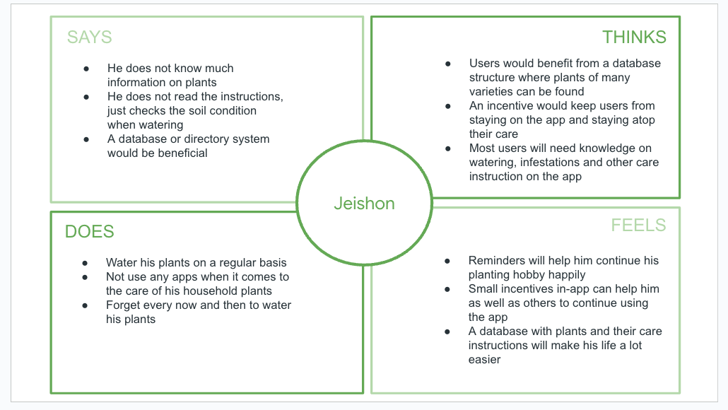
Figure 1.2: An empathy map of Jeishon (one of the participants in the user interviews).
Empathy Maps - as an extension of the user interviews, 2 participants were also included in the creation of two empathy maps. These diagrams showcases exactly what a user says, thinks, does and most importantly, feels. This helps to truly connect with a user on not only what is said, but what is unsaid and felt as well.
User Journey Maps - to fully traverse through the actions a user would perform to accomplish their goal or use-case, user journey maps displayed smaller steps and feelings along their the way. This was a great approach to guide the user flow charts as well as seek improvement opportunities before conceptualizing design ideas.
User Flow - to complement a user’s journey map across tasks, small user flow diagrams were created to get an idea of the information architecture and navigation of the app as well as how many different screens were needed.
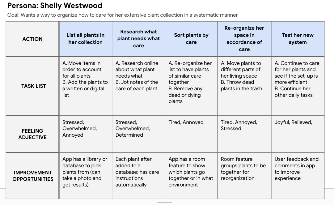
Figure 1.3: A user journey map to help Shelly organize a way to care for her extensive plant collection.
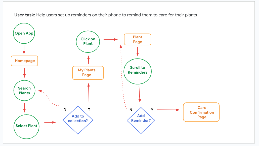
Figure 1.4: A user flow diagram for adding a plant to a collection and setting reminders to care for it.
2) Conceptualize
Low-Fidelity Wireframes - the first step in the ideation process is to get as many ideas onto paper as possible and then select the best features from each screen and convert the paper wireframes into digital wireframes on Figma.

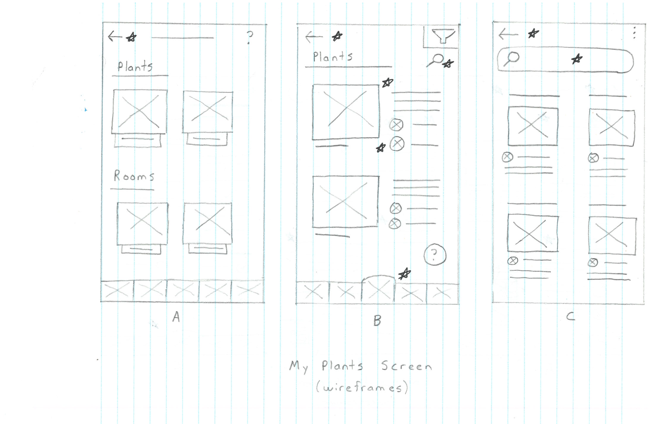

Figures 2.1: Low-fidelity paper wireframes of the Home Page, My Plants and Search Plant screens (top to bottom).

Figure 2.2: A snapshot of the low-fidelity wireframes that were created upon conceptualizing all instances of the paper wireframes.
Low-Fidelity Prototype - once all the digital wireframes were designed on Figma, the connection nodes were created between different screens and buttons to create a low-fidelity prototype. This prototype’s main functionality was to show user flow and give a general sense to how the UI of the final product will look. It also demonstrates to users how basic functionality will work. This is a crucial step when it comes to performing usability studies and conducting user testing.
Usability Study - upon the completion of the low-fidelity prototype, a moderated usability study was conducted to have users interact with the prototype and perform user testing. The main research questions revolved around navigation flows and features from the prototype to see if anything can be improved in that aspect. Some key performance indicators (KPIs) that were taken into consideration were: time on task, user error rates and conversion rates. The study was conducted remotely through a video call and lasted about 15 minutes approximately with the same 3 users from the initial user research interviews.
After presenting the prototype to users, they were assigned with completing small tasks on the prototype’s interface. Their click path, observations, quotes and KPIs for each task were recorded for improvement purposes and user feedback.

Figure 2.3: Notes from participants in the UX Research Study documenting their click path, observations, quotes and task completion while monitoring KPIs.
Competitive Audit - the final step of the conceptualize process was to seek inspiration from direct and indirect competitors who provide similar products and services. The two direct competitors, PlantNet and Planta, were studied as they were both mobile apps with similar features. Their target audience, unique value proposition and visual styles and elements were studied and considered for areas of improvement. The indirect competitors, Bloomscape and The Sill, were studied as they were desktop websites that sold plants and provided valuable information in terms of plant knowledge, navigation and accessibility. Multiple facets of each competitor were documented in this audit for research and design improvement opportunities.
3) Design
Pattern Identification - upon receiving feedback from the usability study and comparing designs with competitors, the design process started with identifying common patterns and themes that needed to be incorporated into the final product. Initially, certain themes were recognized as more common than others. For example, users seem to like logging into a previously created account for mobile apps and users tend to recognize search functionality without any major interventions.
Insights - logically, the next step was to take the themes and patterns that were presented and create insights out of them. For example, since users tend to login or try to use a previously linked account for sign ups, the sign up screen should be organized in such a way that makes it easy for users to do so.
The insights were then prioritized into three categories: Priority 0 (P0), Priority 1 (P1) and Priority 2 (P2).
P0 - high priority - must be used for a minimal viable product (MVP)
P1 - medium priority - nice to have but not needed for a MVP
P2 - low priority - if time permits, these changes can be made
Affinity Diagram - the last step before starting the final designs was to organize key pieces of feedback into groups. This was done on Padlet; an online tool to help organize thoughts, ideas and brainstorm for any future plans. The organization of notes also helped reveal key improvement opportunities that were common across multiple end users.
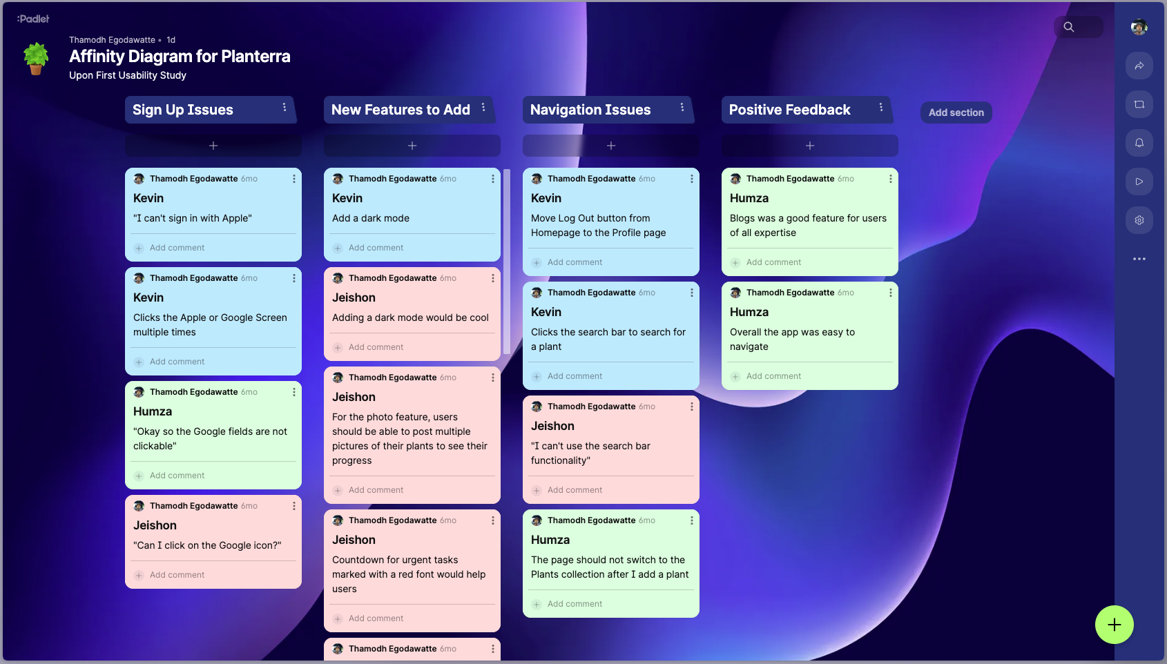
Figure 3.1: Observations from the UX Research Study that were categorized on a online board using Padlet to discern immediate user needs in the high-fidelity mockup.
Hi-Fidelity Mockup - final designs were set to commence and the mockups were done on Figma alongside the low-fidelity wireframes. All comments and research from the usability study, competitive audit and affinity diagram were taken into account when designing the final mockups. The affinity diagram and prioritized insights were helpful in determining what order of visuals elements and design problems should be done first.


Figures 3.2: Hi-Fi Mockups for the Welcome, Sign Up and Search Plant screens using the colour and text styles
Hi-Fidelity Prototype - once the mockups were complete with the use of text styles and colours (all documented onto a sticker sheet) and all the high and medium priority insights were accounted for, it was time to add connection nodes and build the high-fidelity prototype.

Figure 3.3: Colour styles and Text Styles chosen for the high-fidelity design.

Figure 3.4: Sticker sheet for the high-fidelity design.
04 Takeaways & Next Steps
User Research is the Foundation; It is so important to do initial user research and user testing along each phase of a case study or project. You learn so much in terms of how to improve your designs as well as your overall creative process.

Sacrifices are needed for User-Centric Designs; At the end of the day, your users will be the ones interacting with your designs so their needs are top priority. There are times where you have to sacrifice your own creative ideas for the betterment of your user’s experience with your product.

Good Design is implied through User Experience; Typically as a designer you wish to be praised or receive accolades for your work. However what I learned is that good design is so seamless and just makes sense to the user that they do not often comment on it. It is not a bad sign that you do not hear as much positive feedback as you do negative feedback. The more things flow in your design, the less people will comment and just enjoy and experience the value of the product.

Next Steps - Iteration is key in design so some next steps for me would be to keep this case study open to any changes in the future. Whether it be the addition of a new feature or a change to the colour scheme, it is important to be in a path of continuous movement and improvement in the world of design. I also leave this case study open for anyone to comment and provide meaningful insight on.
05 Connect
If you would like to provide feedback on this case study or would like to connect to collaborate on future projects, feel free to reach out to me via email at thamodh.e@gmail.com.
You could alternatively get in touch via my Contact Page:

